Insights Dashboard
IRIS+ Insights is a brand new module that Irisity offers for customers who want more curated insight into the trends and statistics from their monitoring sites.
Introduction to Insights Dashboard
The Insights module is a new one that offers customers a perspective across the detectable activities at their sites. These data sets are taken from occurrences triggered in the past, and collected to allow customers to splice the data to their desired visualization preferences.
The Insights module contains these primary functions
- Create and personalize your dashboards
- View and make sense of a dashboard
Before you begin
To ensure that your dashboards generate properly, please make sure you meet the minimum requirements:
- Have an active camera on an edge device with one of the following rules or statistics active:
- Statistic rules
- Crowd statistics
- People counting
- Traffic statistics
- Any real-time event rules
- At least one event or one statistic reported
The Insights module relies on many functions, each one renders a specific part of the dashboard in a particular way. Therefore, it is crucial to know the general fields that will most likely be used regularly when creating a dashboard.
Data sources
A data source is essentially the back-end table that holds all instances of real-time events or statistics. Each data source provides a list of data that describes events, which typically includes:
- Event reported start & end time
- Rule type
- Object detected
- Time of event or statistic reported
- Camera name
- Camera ID
- Folder information
You must select the right data source that includes the actual data you need. To do so, be sure to remember which cameras have the rules or statistics you are interested in. Selecting the incorrect data sources of the wrong cameras will make your panels blank.
Graph Types
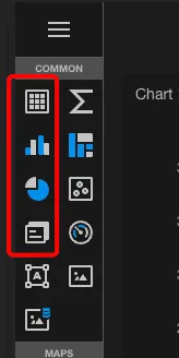
There are 11 types of graphs available in Insights. This includes bar charts, pie charts, pivot tables, grid tables, etc...the most popular graphs to use are
- Pivot / Grid table
- Graph chart
- Pie chart
- Cards
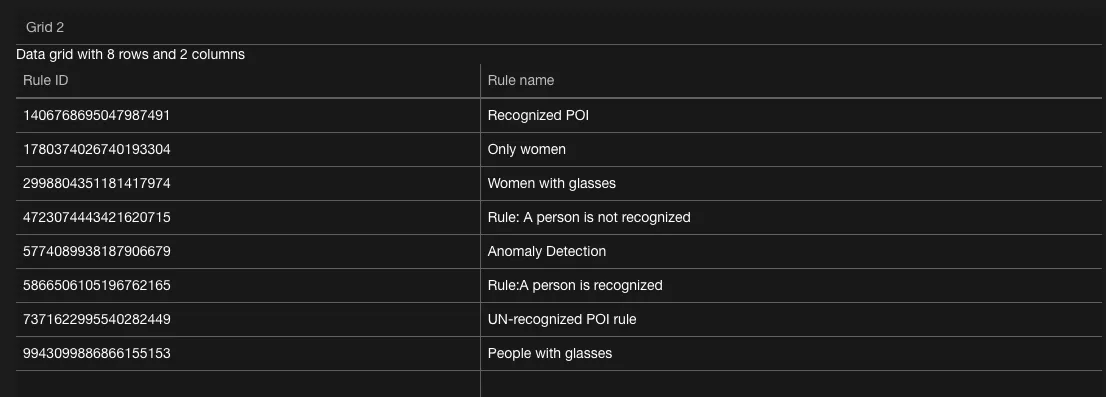
A grid table will typically look like an Excel sheet, where the table consists of columns and rows of information. Each column has a header, each row has an interval of data.
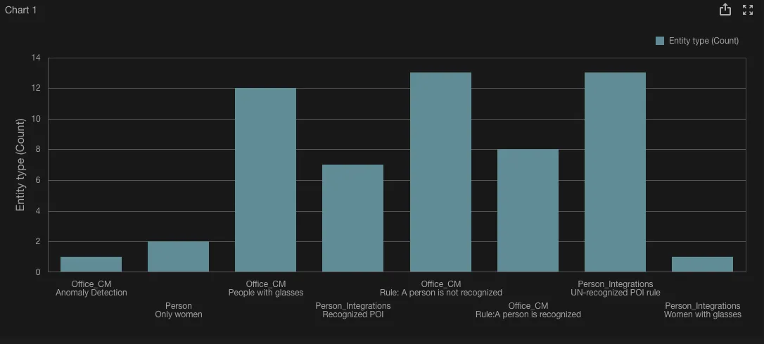
A graph chart represents bars in a graph, which contains an x-axis and a y-axis.
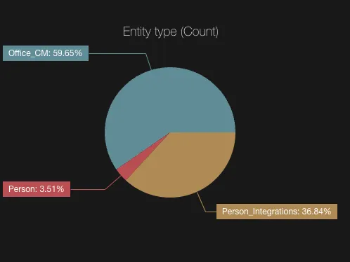
A pie chart represents a circle divided into pieces, hence the name "pie". Each piece represents a portion of the entirety of a source.
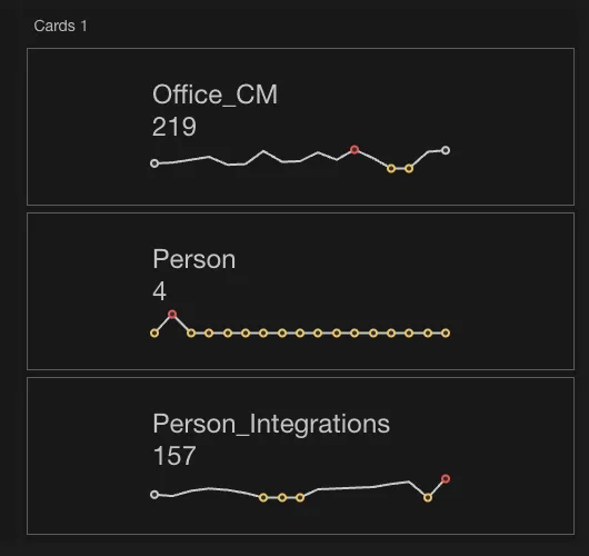
A card represents one value taken from a source. This could be taken from any source specified from your data source.
Bindings
To render a visual in a panel of a chart, you must bind fields from a database to show. There are a few places you must have bindings for in each panel:
- Values
- Arguments
- Series
For particular types of panels there may be additional points of information you can also configure. To learn more, check out the advanced user guide
Create an Insights dashboard
There are two methods for creating a templated dashboard today:
- Templated dashboards - Quick and simple pre-configured dashboards that require little to no setup. These dashboards work as it is configured. These are best suited for users who are looking for something quick and simple.
- Custom dashboards - Manual method of creating dashboards. These dashboards require custom configurations, best suited for users requiring specific setups and reporting.
Create a new dashboard with Templated Dashboards
To set up a templated dashboard, click on +New Dashboard followed by selecting a Data source

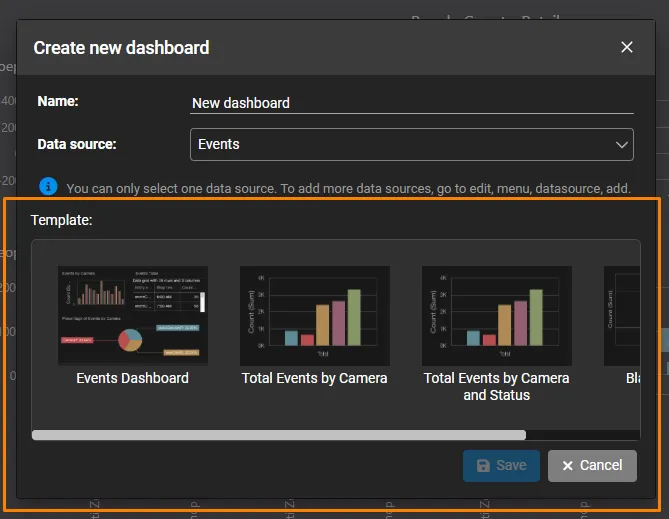
Each data source will have its collection of available templated dashboards, all preconfigured for quick setup and operations.
Select one of the templated dashboard options, then click Save at the bottom of the pop-up. This will create a new dashboard on the screen with the prepopulated widgets
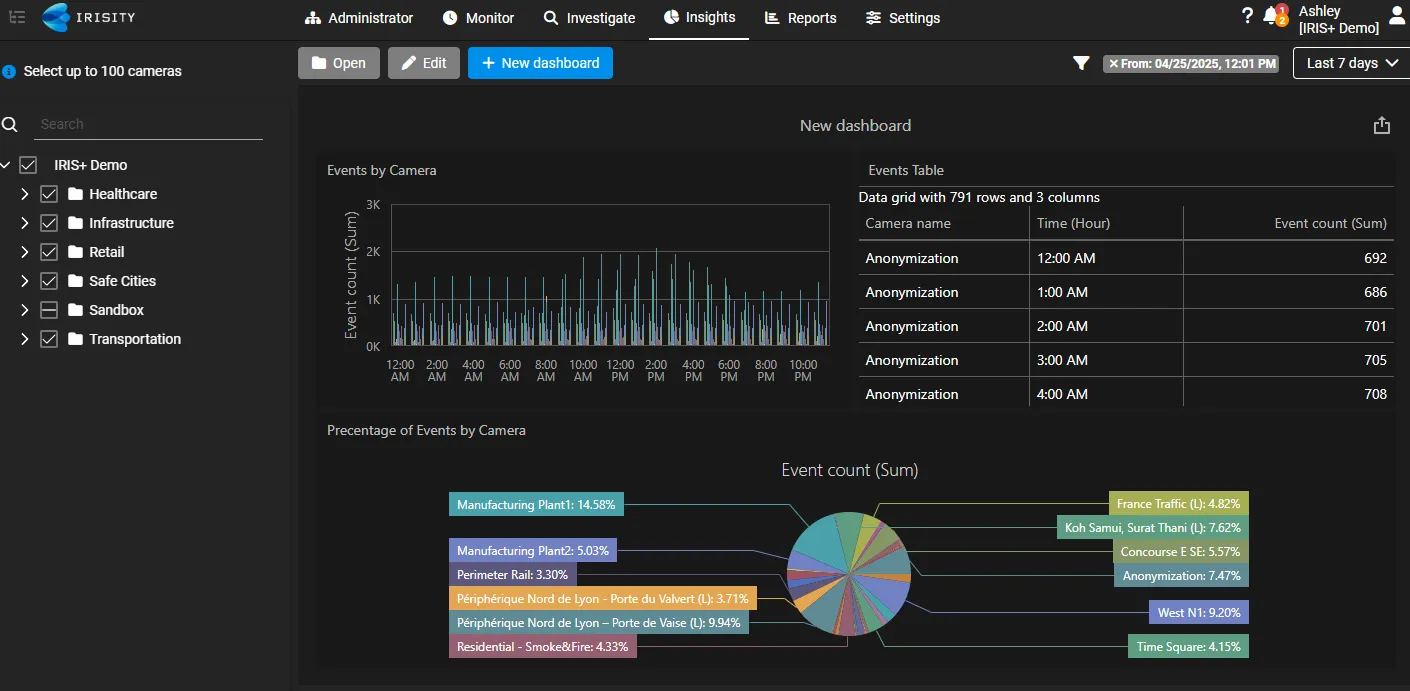
If all looks correct, no further actions will be needed from this point.
Be sure to select the correct folders, cameras, and time range before exiting Insights.
If the templated dashboard isn't exactly curated to your needs, you can always edit the templated dashboard and save it as a custom dashboard.
If you edit and save a templated dashboard after its creation, you cannot revert to the same dashboard as its original template dashboard version.
Please create a new templated dashboard if you would like to have the original templated dashboard set up.
Create a new heatmap dashboard with Templated Dashboards
In addition to the regular dashboards,
Create a new custom dashboard
The Insights module can offer quick and easy visualization functions to help you get a dashboard up and running without any hassle. The most basic visualization options the module offers are:
- Creating an aggregation of data over time in a graph
- Creating a count in a panel that updates every couple of minutes
- Creating columns of fields of interest
To create a new dashboard, click on the button: +Create a new dashboard followed by selecting a Data source.
Instead of selecting a templated dashboard, you will need to select Blank Dashboard, which will a dashboard from scratch.
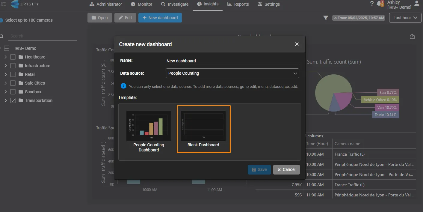
Today, we offer the following types of data sources to connect with your dashboards:
- IRIS+ Crowd statistics rules: This selects data from cameras that collect crowd statistics
- IRIS+ People counting rules: This selects data from cameras that collect people counting statistics
- IRIS+ Traffic statistics rules: This selects data from cameras that collect traffic statistics
- IRIS+ Health events: This selects data from cameras that have generated health events or alerts
- IRIS+ Events: This selects data from cameras that have generated real-time events
These data sources are derived from all histories of events and statistics that have occurred from your cameras and devices within the past 30 days.
To properly generate data in the dashboards, it is recommended that you select a data source with cameras configured with the same statistics or events for at least a minute.
You can connect your dashboard to more data sources from this list after its creation.
Create a heatmap dashboard
Available on 12-Aug 2025
Lastly, a heatmap dashboard is a templated dashboard that shows information about the frequency of people dwelling in certain hot spots of a monitored area.
How is this different than a regular templated dashboard?
Unlike templated dashboards, a heatmap dashboard only shows heatmaps in each monitored area that runs the people counting rule. This is the only dashboard option currently in Insights that does not allow for customization or editing, meaning you cannot add any additional types of widgets to it.
Creating a heatmap dashboard
Like the other dashboards, you will first need to create a new dashboard.

When creating your new dashboard, scroll down to the option "Heatmap" in the data source drop-down field.
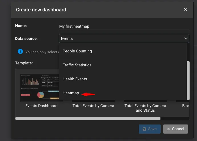
This will display the option to create a heatmap dashboard.
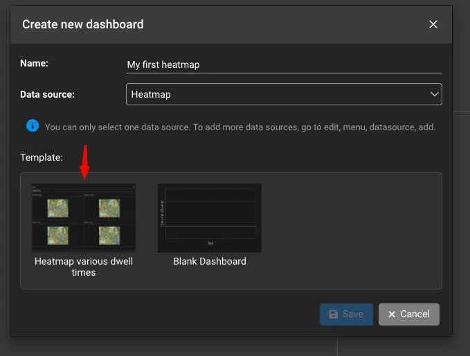
Click on the heatmap option in the template section, then click the save button. Once you complete this step, a heatmap dashboard will be generated.
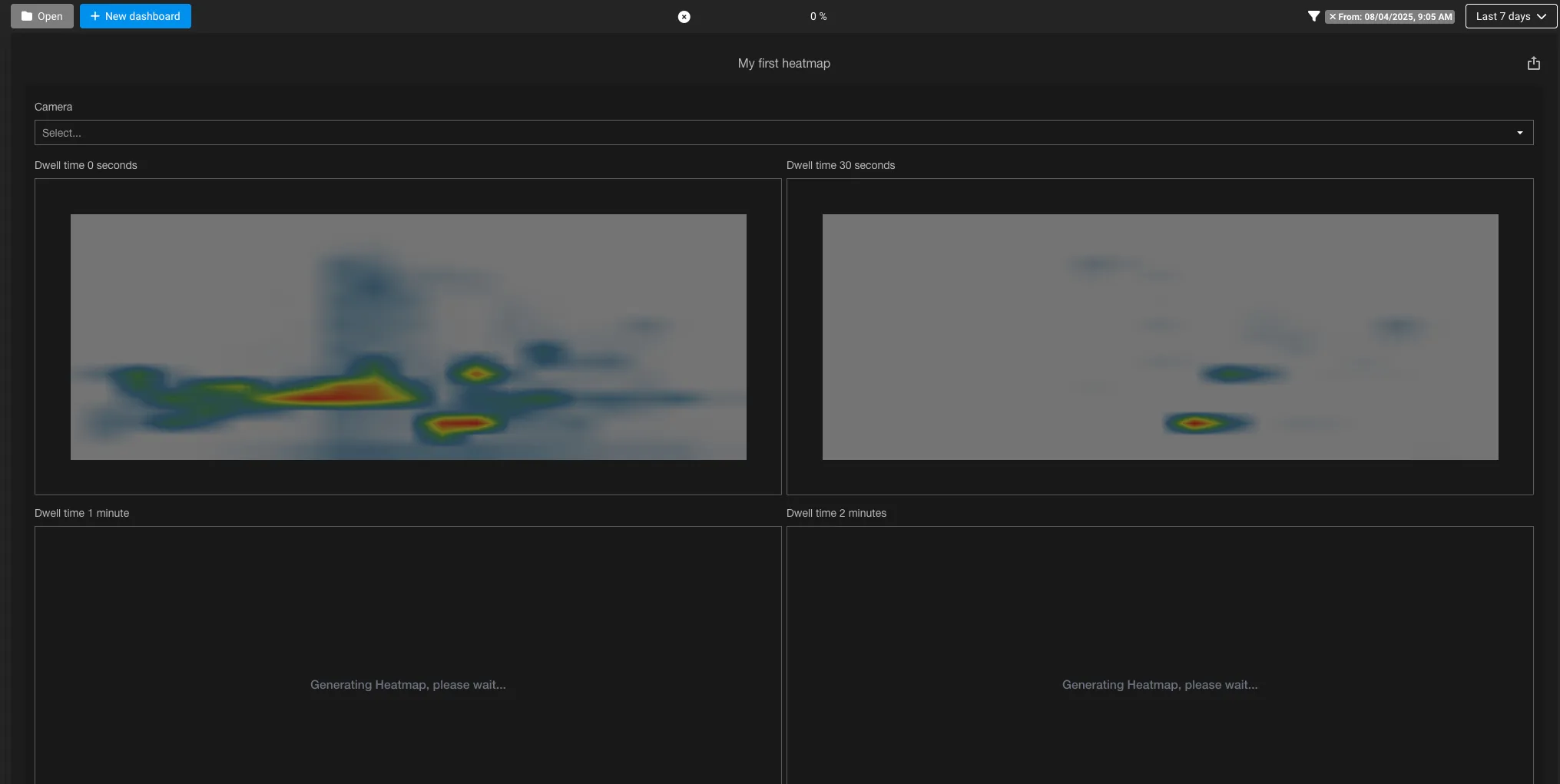
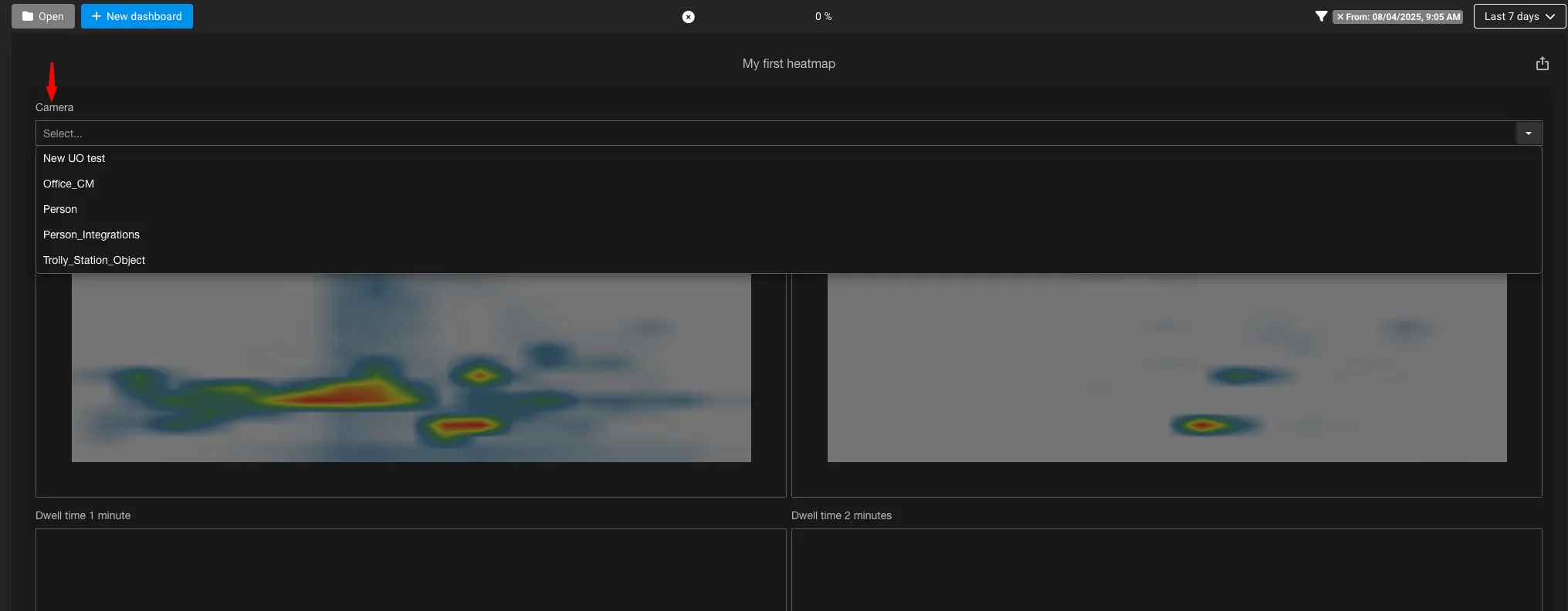
Initially, you will see the heatmap dashboard attempt to load. At this point, you will need to adjust the following:
- Selection of cameras in the camera tree
- Select the specific camera in the dashboard
You will notice that at the top of the dashboard, the rendering progress is at zero. You must select a specific camera in the dashboard to properly generate a series of heatmaps.
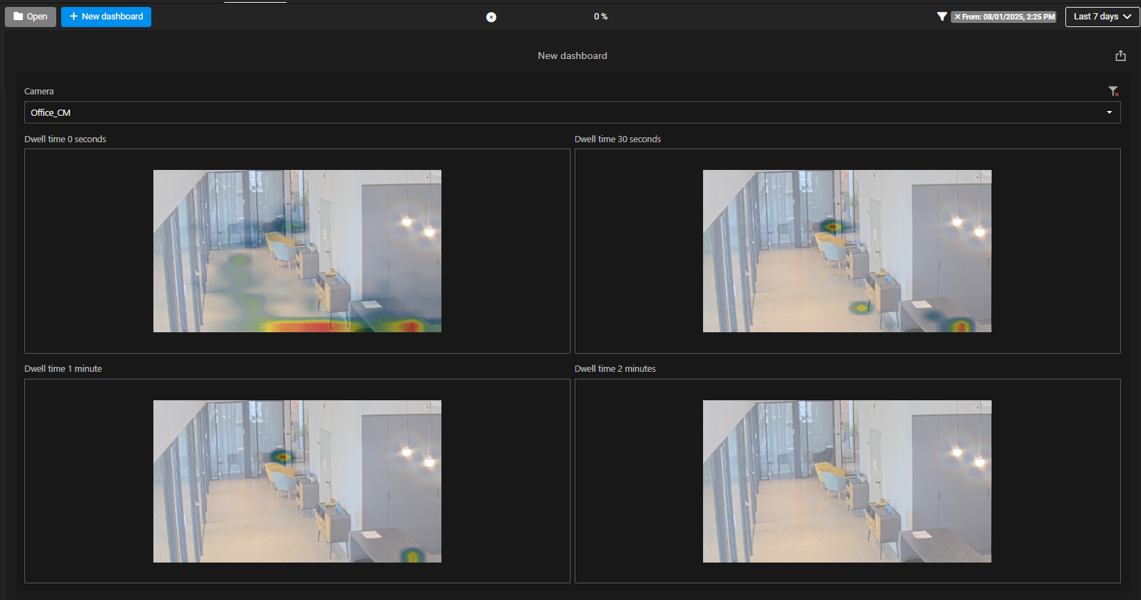
Once you've selected one of the cameras, a series of heatmaps will be created across several dwell times.
Examples of Insight dashboards
Below you can find a list of example dashboards that can help you get started:
To create a basic crowd statistics dashboard, create a graph by selecting the following functions in order:
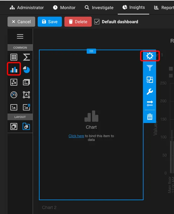
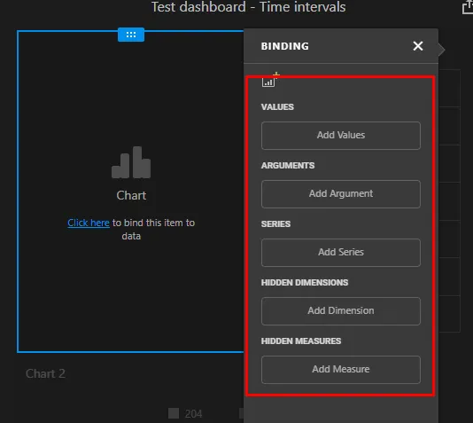
Be sure to click Save at this point to lock in the fields you have just set up.
Lastly, go to the time range selector and select a time range that best fits the duration of time you need. In this example, we will use the range Last 7 days to show the average crowd count across each camera for the last 7 days.
To create a basic object-counting dashboard, create a graph by Clicking on the same graph chart option. Then, select the gear icon and configure the following fields
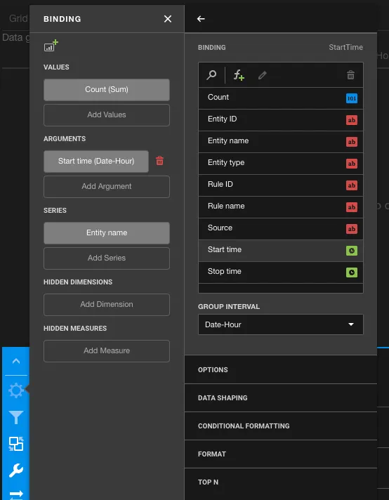
Once completed, your graph should look similar to this over the course of a 30 day range
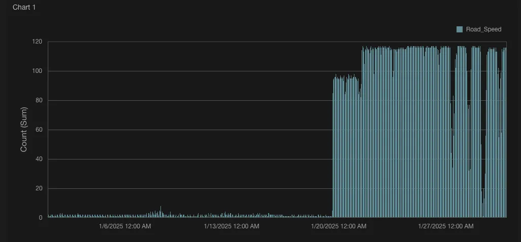
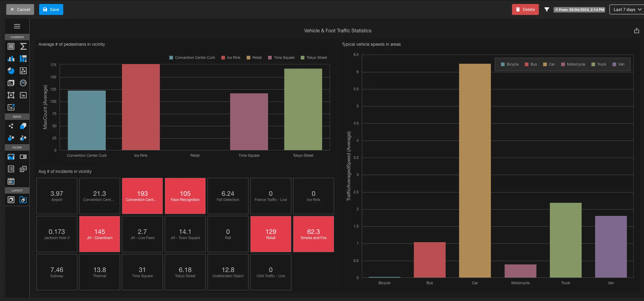
Example: Basic vehicle statistics dashboard in a graph chart
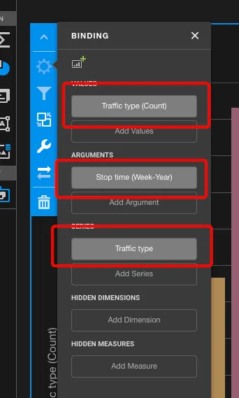
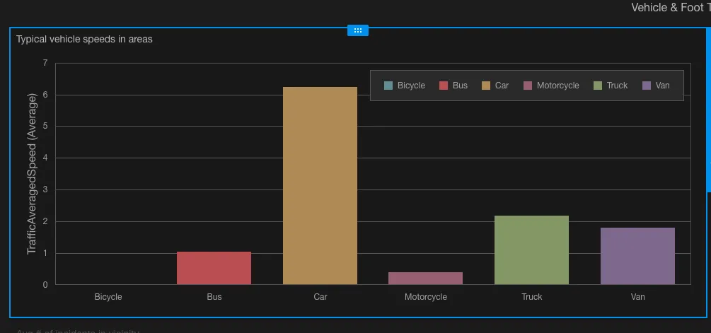
To create a basic vehicle statistics dashboard, select IRIS+ Traffic Statistics as your data source first. Then, click on the same graph panel option, followed by the gear icon when hovering on the blank panel.
Then, set the binding fields as follows:
- Add Values. Traffic type (Count)
- Add argument: Stop time, with group interval: Week-Year
- Series: Traffic type
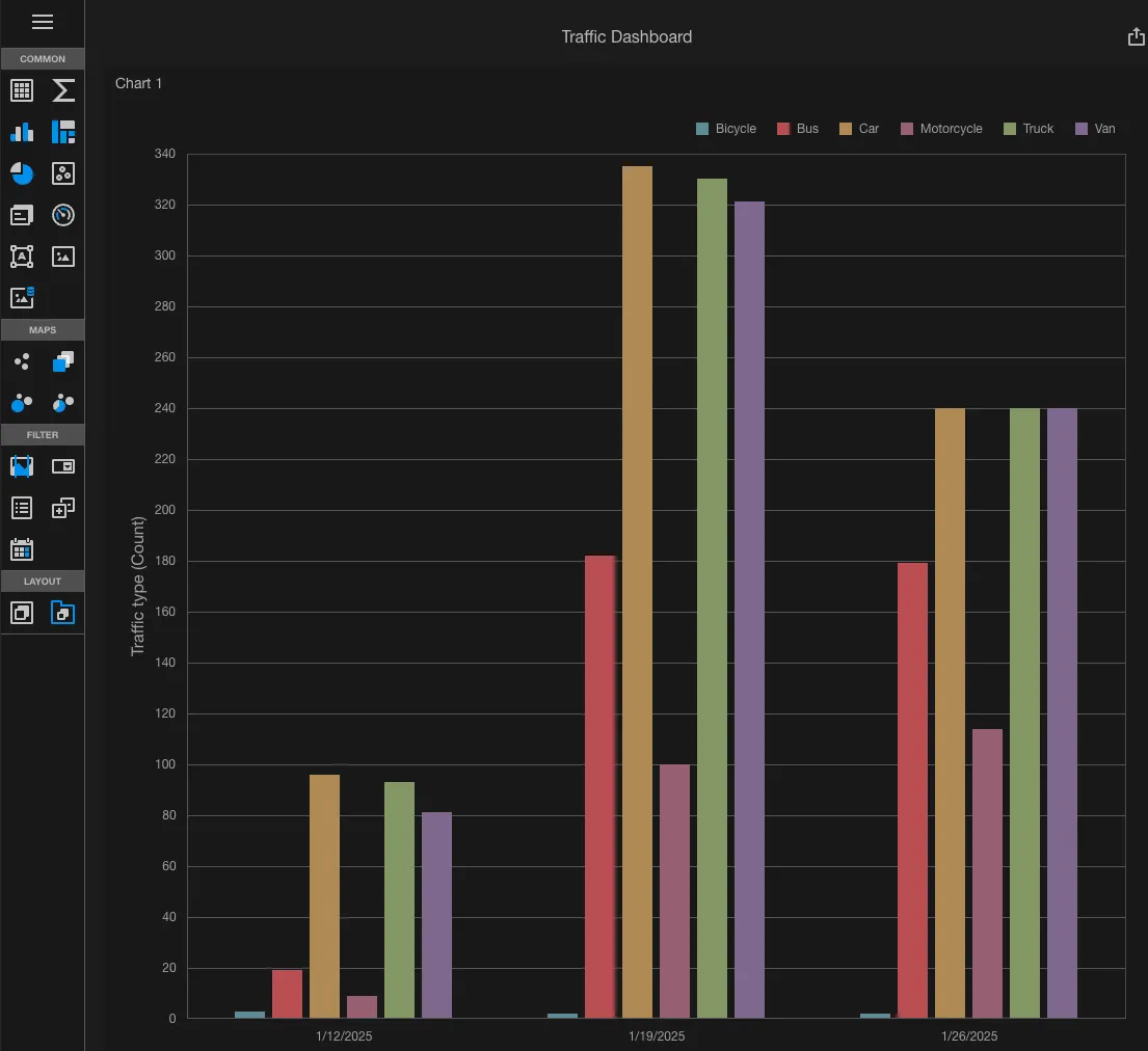
This creates a view of a graph that showcases the types of vehicles detected across cameras by the week. The date displayed on the x-axis shows the date that starts at the beginning of the week.
Example: Show the latest value of events created in card chart
Start by creating a new card panel with the data source IRIS+ events selected
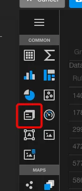
Then set the fields in the following manner:
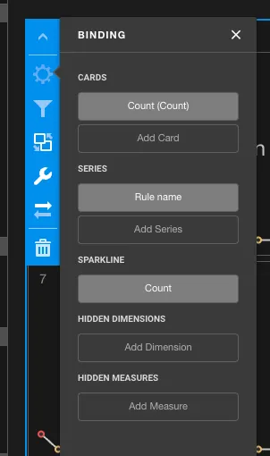
This will then create a view of cards based on the rules name set, showing both the latest count reported versus a show of count over time.
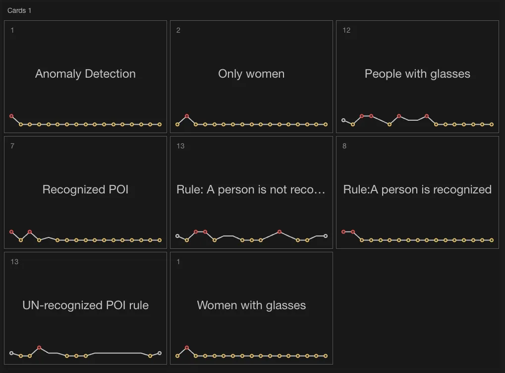
Top left number shows the current count reported, middle label shows the rule name, and lastly the sparkline is showing the counts reported overtime.
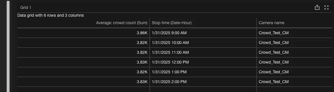
Example: Basic pivot table of crowd statistics
To create a basic pivot table with the crowd statistics data source, select the pivot table option
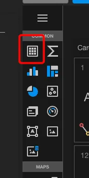
Then, set the fields in the same manner shown here
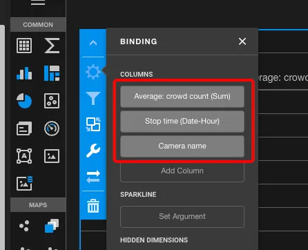
Once you have set this up, the pivot table should start populating information if there are any available
Each account will have a default Insights dashboard, created by us to allow you to play and interact with a dashboard for the first time. This is great for customers who are new to BI tools and perfect for those who wish to learn how they can take advantage of data visualization tools.
To start, locate the Insights tab in your account. If you do not have access to one, contact your sysadmin or Irisity customer support to learn more.

In this Insights tab, you will see a default Insights dashboard that has already been created:
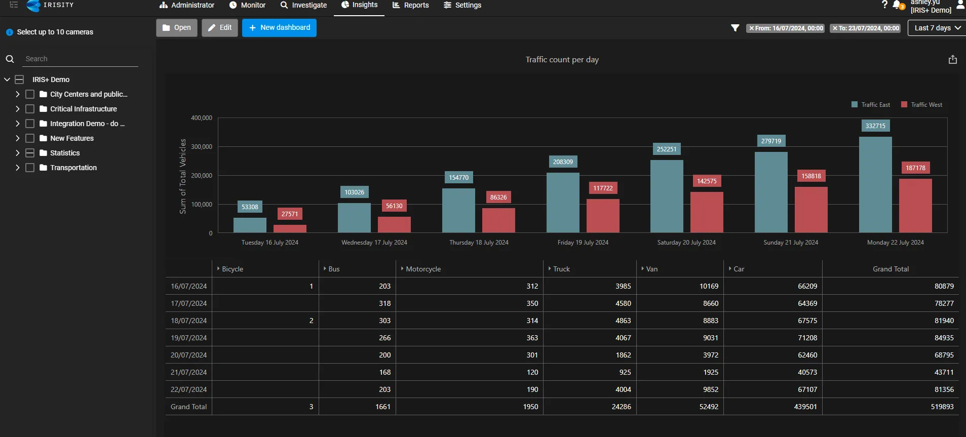
This dashboard can be customized and manipulated to any degree, providing flexibility for those learning the functions for the first time.
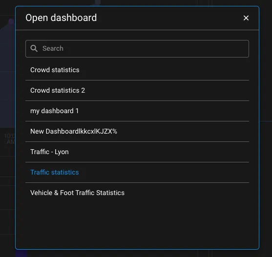
For those that have created a new dashboard, you can access a saved dashboard by clicking on the Open dashboard button at the top of the dashboard options. This opens a menu list of existing dashboards you can load.
Start by clicking on Edit dashboard after creating a new dashboard.

Be sure to click Save after you have selected 10 or less cameras in the camera tree. Once this is done, click on Edit dashboard to open up the edit mode.
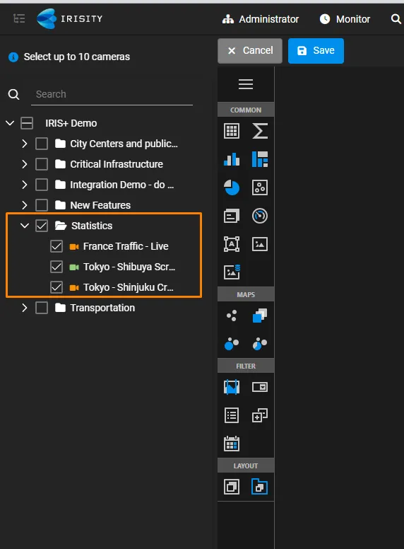
In the example above, you can see that we have selected all the dashboards under the folder "Statistics".
You should also now see options on the left filled with different visualization options. The most common options we offer are
- Graph
- Grid
- Sum
- Count panel
- Pie chart
- Scatter chart
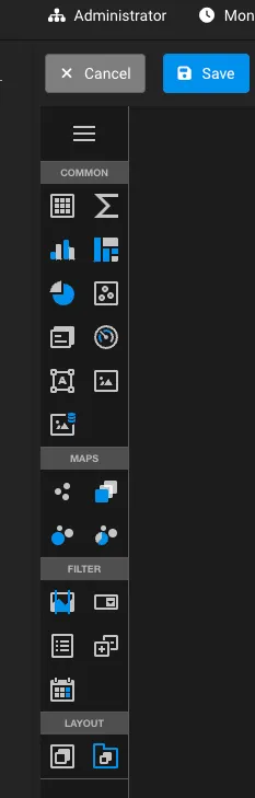
Other miscellaneous options include
- Uploading an image
- Adding text boxes
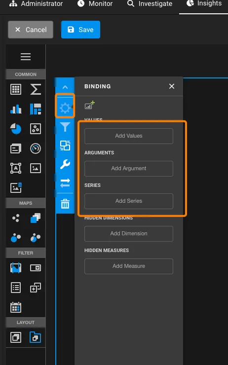
In the values section: Click Add Values
- This will open up dialogue to select and available value type. This value type is dependent to the data source(s) you have selected or added to your dashboard.
- In this example, the data source containing event information has been selected, because in my case I want to see the count of all events that have occurred across time.
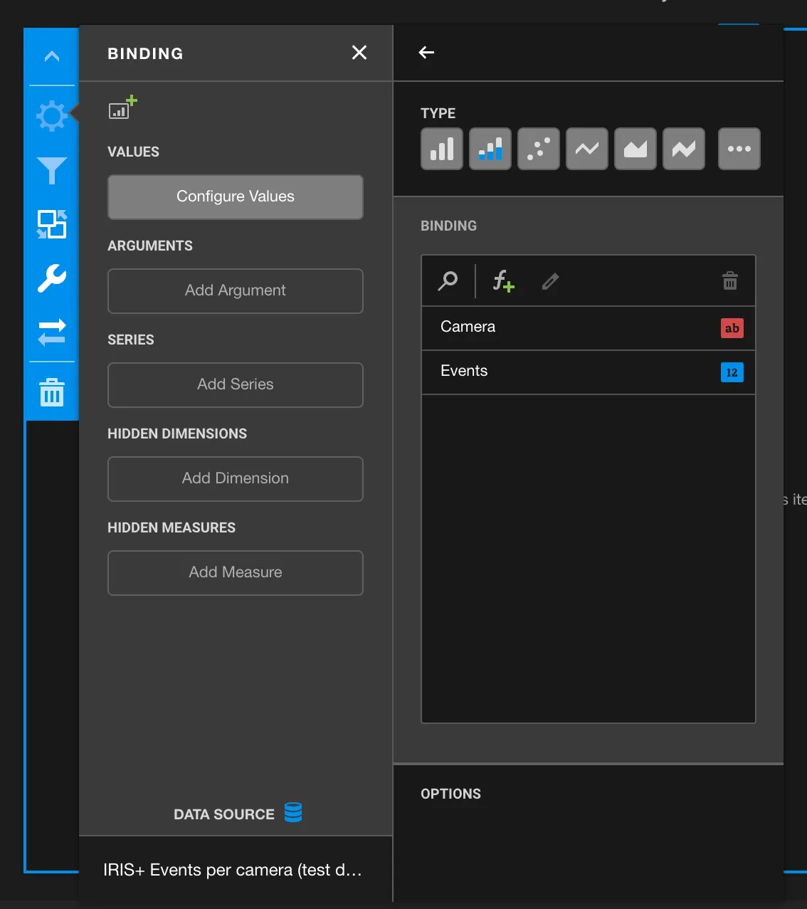
- As an argument field, we will now select the argument as camera, because we would like to see the different numbers of events that occurred between different cameras overtime.
- To visualize metric over time, you will need to set at least the argument field to start time, and specify showing the trend per specific time interval
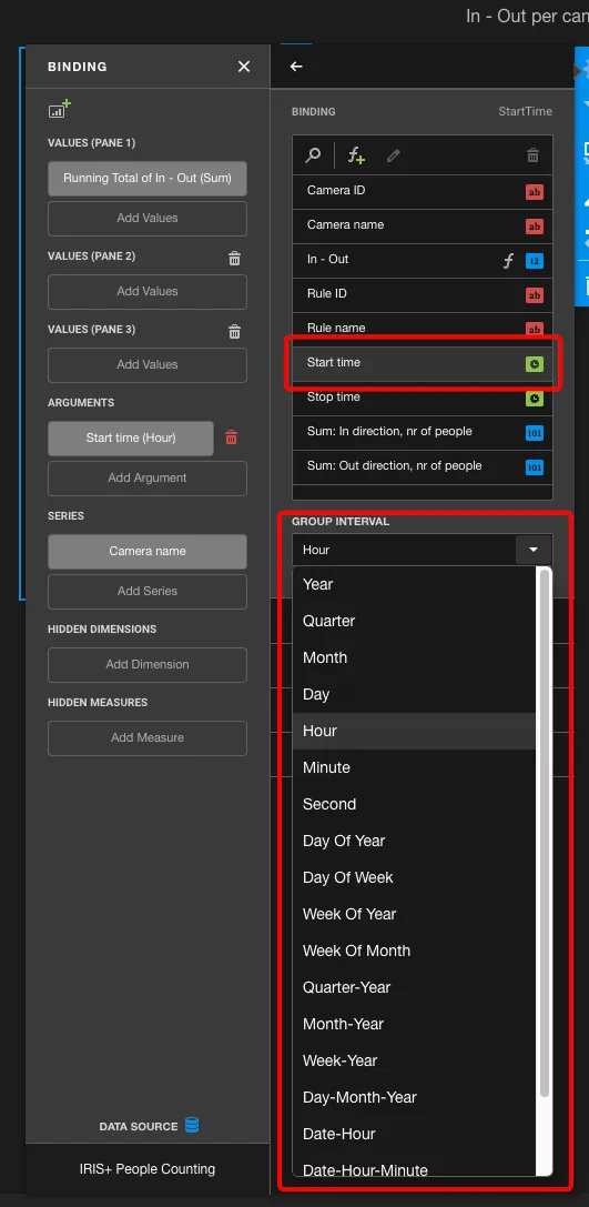
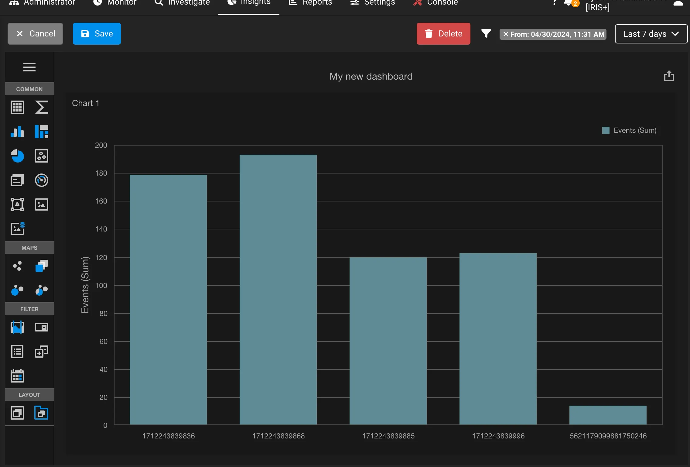
Once you have applied the argument field, you will now see your first panel populated with the value and fields configured across a duration of time:
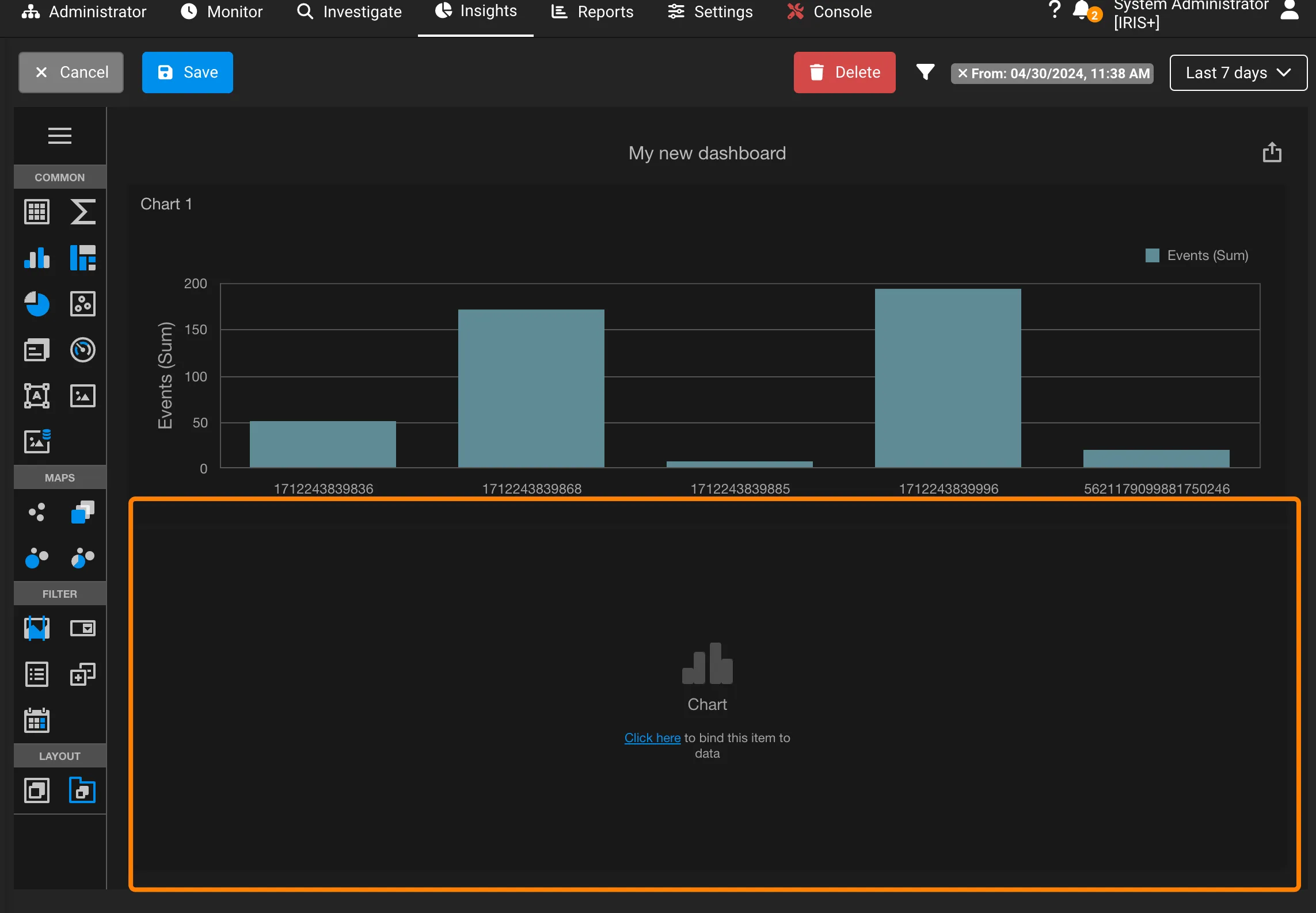
To add a new panel in the same dashboard, simply click on another visualization option and the dashboard will automatically place and size the blank panel in the same view, running through the same exercise we just did.
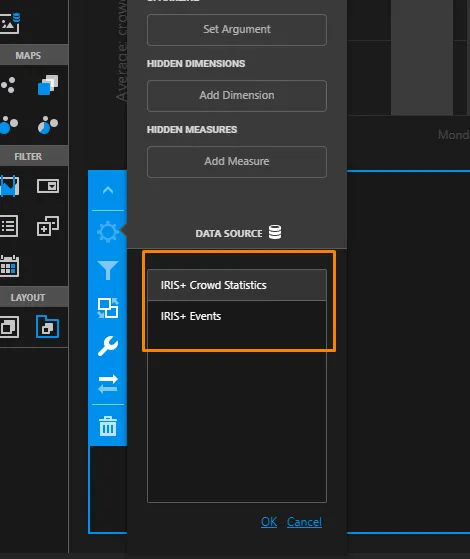
But what if you want to add another data source in the same view?
Managing a dashboard's layout
Managing a dashboard's layout is very simple. All you will need to do in the edit mode is to drag and drop each panel by selecting each panel at a time and moving them around the dasbboard:
Dropping them in the screen will automatically scale the panel to fill the page